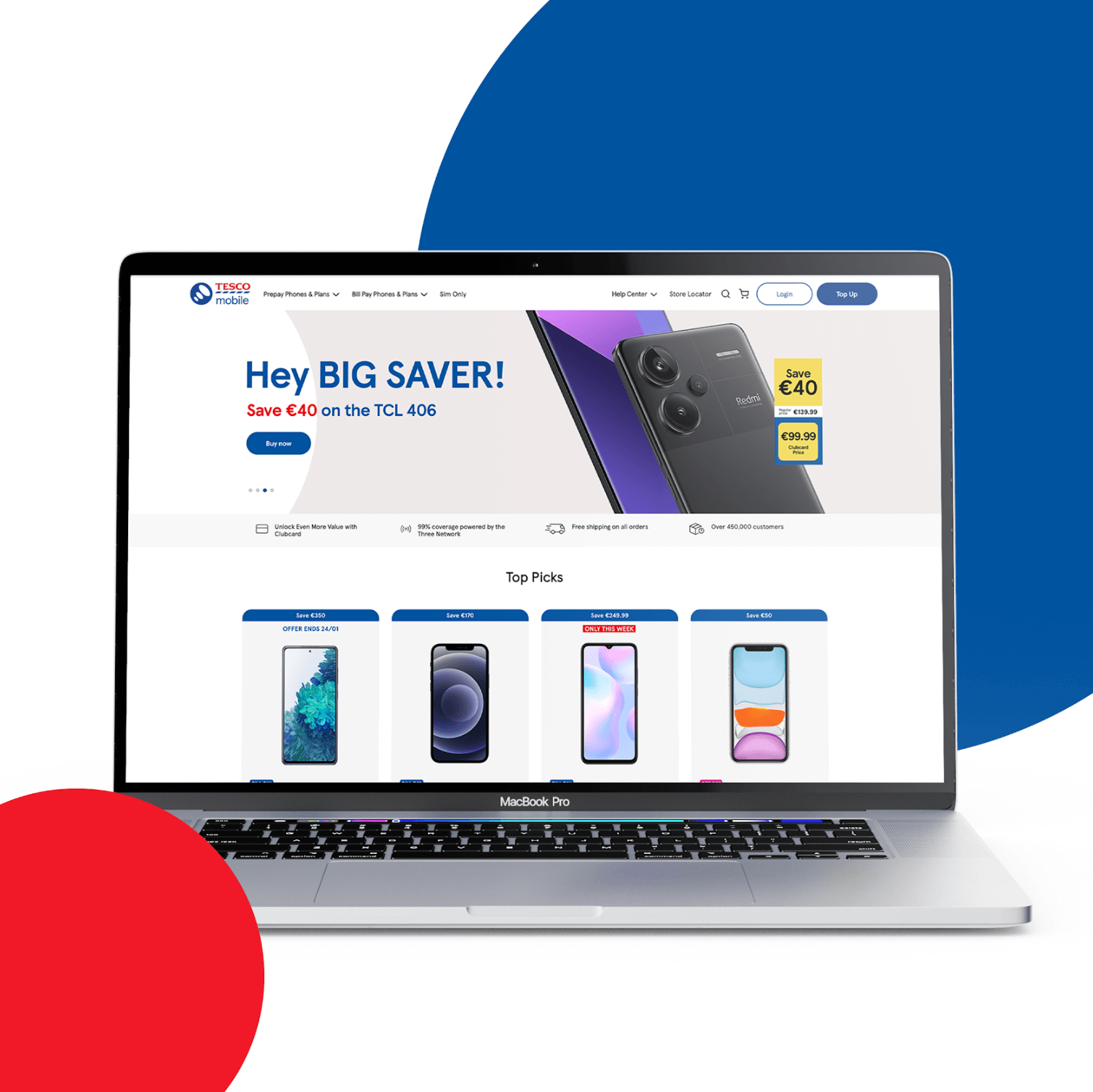
The project’s primary objective was to double revenue by addressing key pain points in the user experience. This involved modernising the overall design to align with Tesco Mobile’s brand image, enhancing website engagement to encourage exploration, boosting conversion rates by 10%, and reducing shopping cart abandonment by 10%.
Overall, the project sought to improve brand perception and customer satisfaction while also aiming for a 10% reduction in users leaving after the first page (excluding top-ups).
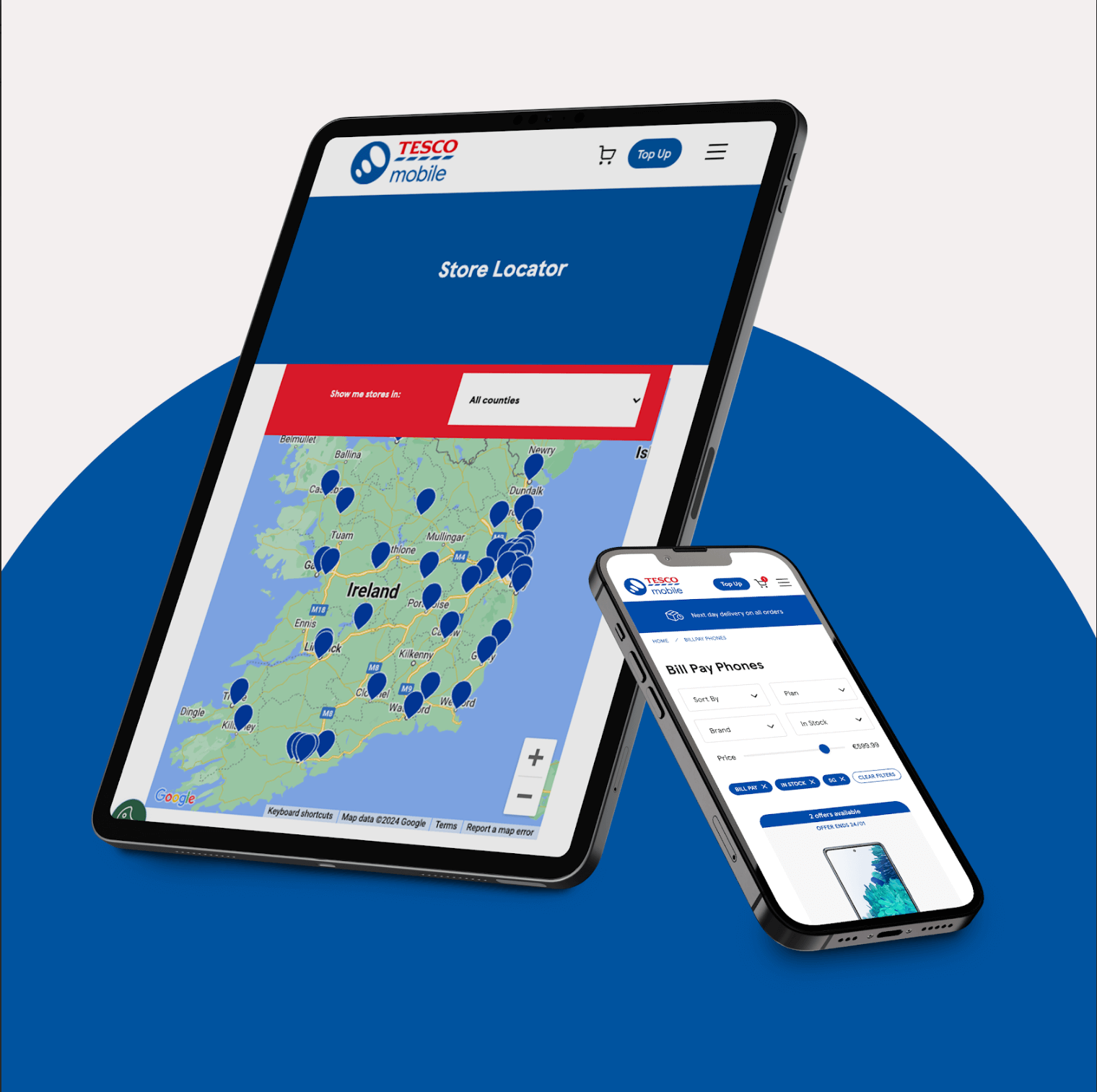
The core concept was to simplify and streamline the user experience while emphasising key elements that would resonate with Tesco Mobile’s target audience.
This involved decluttering the interface, improving visual hierarchy, and highlighting essential information such as product features, and pricing. The design also sought to create a sense of modernity and trustworthiness, aligning with Tesco Mobile’s brand values.
Granite’s focus on user experience was evident in every aspect of the redesign.
Navigation was simplified with a redesigned menu and the addition of breadcrumbs, allowing users to easily find their way around the site.
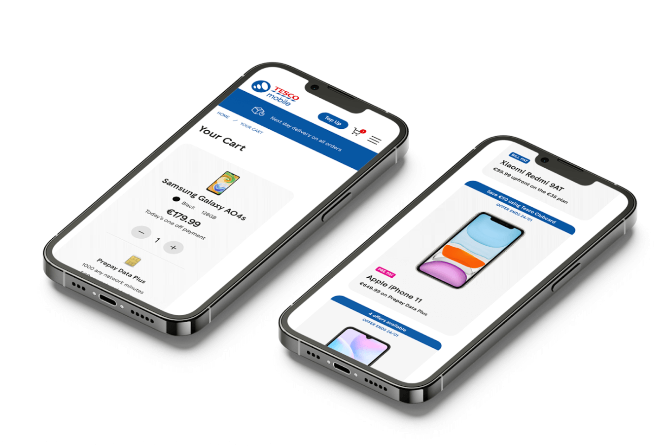
Product pages were overhauled to improve handset price clarity and comparability, prioritising customer reviews and simplifying product descriptions for better readability.
The plans page was streamlined, emphasising the benefits of each plan, and the mobile experience was optimised with consumer-relevant product attributes and an intuitive interface.
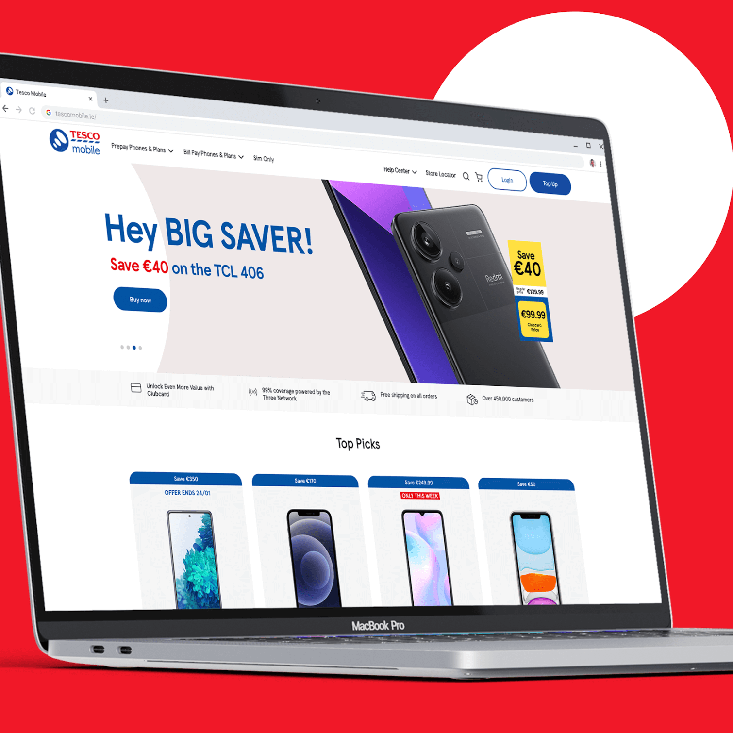
To further enhance consumer engagement, Granite prioritised key elements that would capture and hold the user’s attention.
Special offers and Clubcard discounts were prominently displayed, enticing users to explore further. High-quality product images and informative descriptions showcased the features and benefits of Tesco Mobile’s products, and the integration of customer reviews and ratings added social proof, encouraging users to trust and engage with the brand.
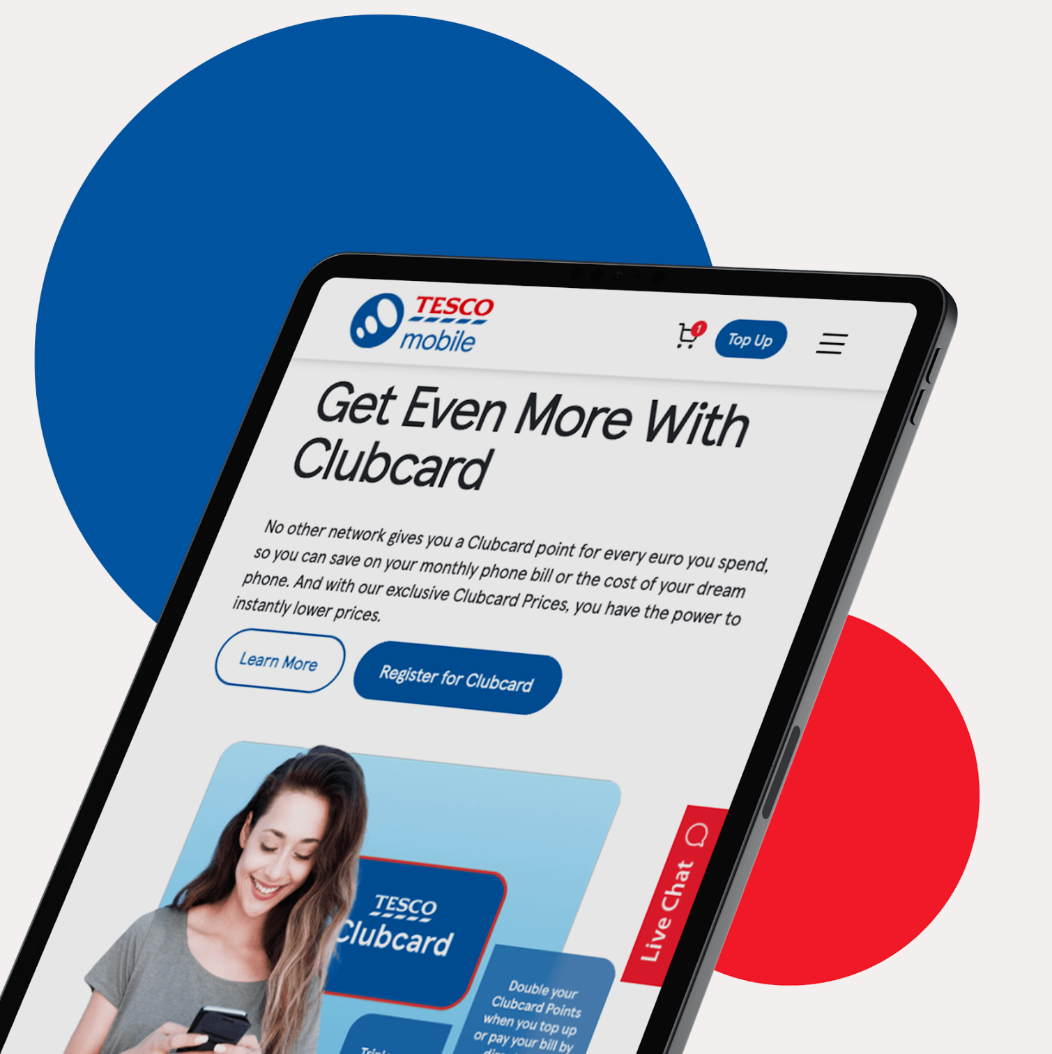
While the primary focus of this project was on design and user experience, content creativity also played a role in enhancing user engagement.
The Granite team crafted compelling and informative product descriptions that highlighted the unique features and benefits of Tesco Mobile’s offerings and then incorporated high-quality product images and lifestyle imagery to create an aspirational feel and connect with users on an emotional level.
Additionally, the strategic use of persuasive messaging throughout the website aimed to drive user action and guide them towards conversion.
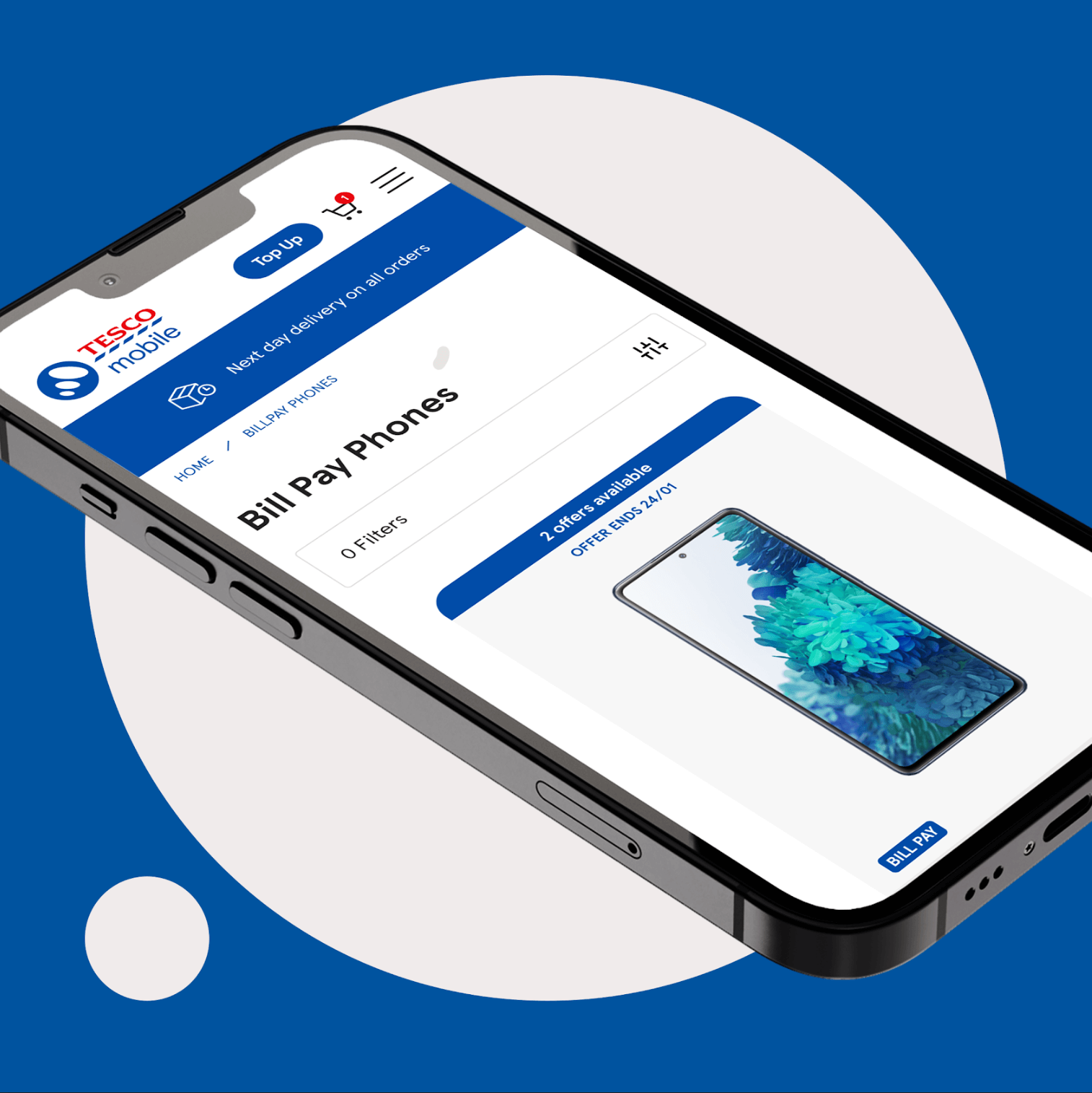
Tesco Mobile’s redesigned website delivered impressive results that exceeded expectations.
30% – Increase in new users
53% – Increase in organic traffic
275% – Increase in conversions
©GRANITE