It was vital for the University of the Creative Arts (UCA) new site to excite and exhilarate prospective students into seeking out more information about the university’s offerings and culture, as for many this would be their first impression of the University.
Content needed to be easily discoverable but contained in innovative and creatively designed pages, being both stimulating and accessible to all users.

The vision of UCA was to be recognised as a global authority on creative arts, creative technologies and business for the creative industries.

Frontend design plays a significant role in user experience and can affect the success of a website, this was something that was of utmost importance for the University for the Creative Arts.
UCA trusted Granite’s expertise to produce a high-quality, best in class website that exceeded their expectations.
With Granite’s dedicated UX research and brand analysis, they worked closely with the University to pinpoint what made them stand out internationally and translated that to a beautiful, responsive website.

Granite focused on areas of core importance including Student Recruitment, Student Retention, Alumni and Research with an integral user-first approach.
Granite created a digital platform that represented the user needs including the new expectation for remote learning and socialisation through digital incorporating everything from live broadcasts to ‘educational influencers’ to virtual reality experiences.

As a digital agency with a wealth of experience we understood that stakeholder engagement is crucial in any project or initiative, as it ensures that the voices of those who are impacted by the project are heard and considered.
Relevant stakeholders included prospective and existing students, international students, parents, businesses, staff and alumni.

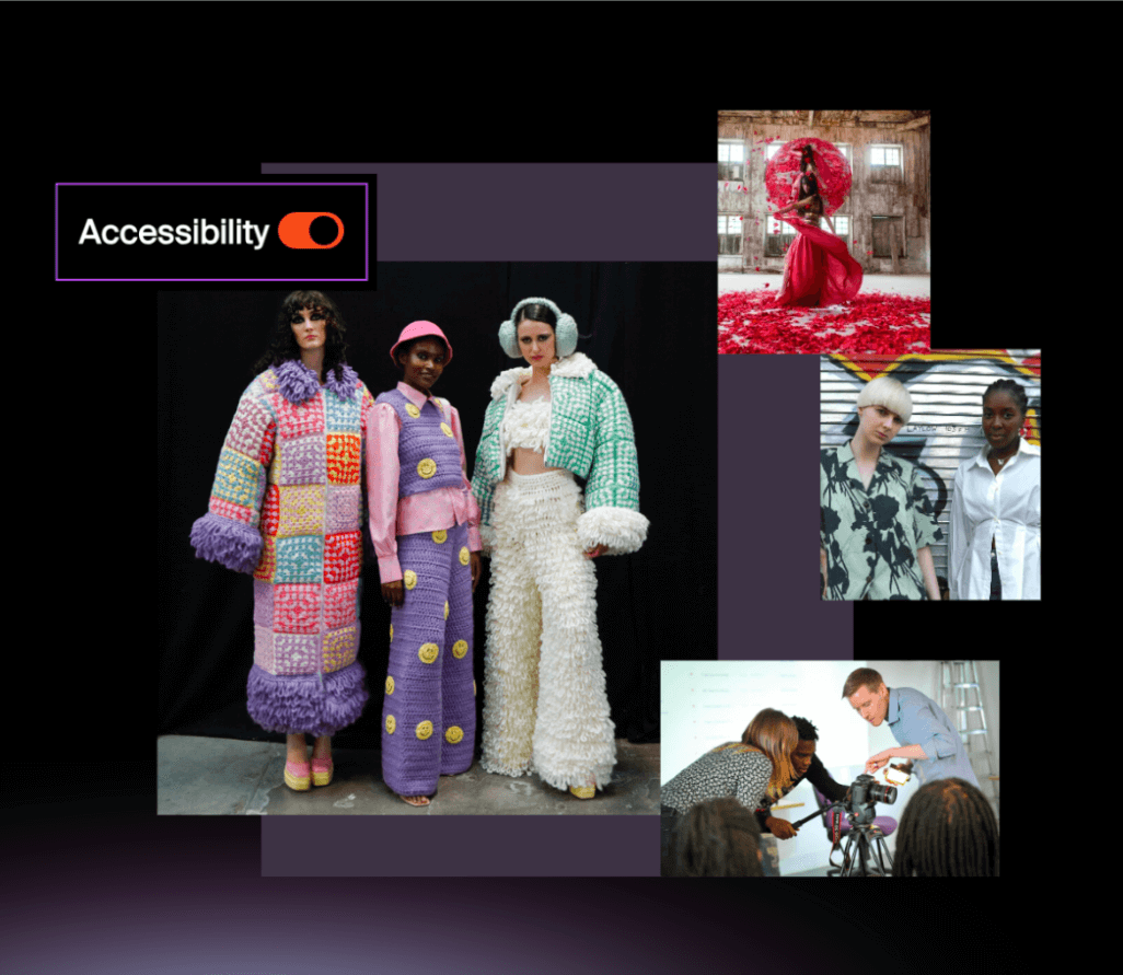
The new website was designed with accessibility at its core.
Accessibility was a key element of this project and it required thoughtful consideration. As part of this project we implemented an accessibility toggle on their website.
As a result of implementing this accessibility toggle and depending on the users needs the colours change slightly, the placement of some headings changes slightly and the motion is reduced or turned off, but the brand remains the same and the design or user experience are not compromised.

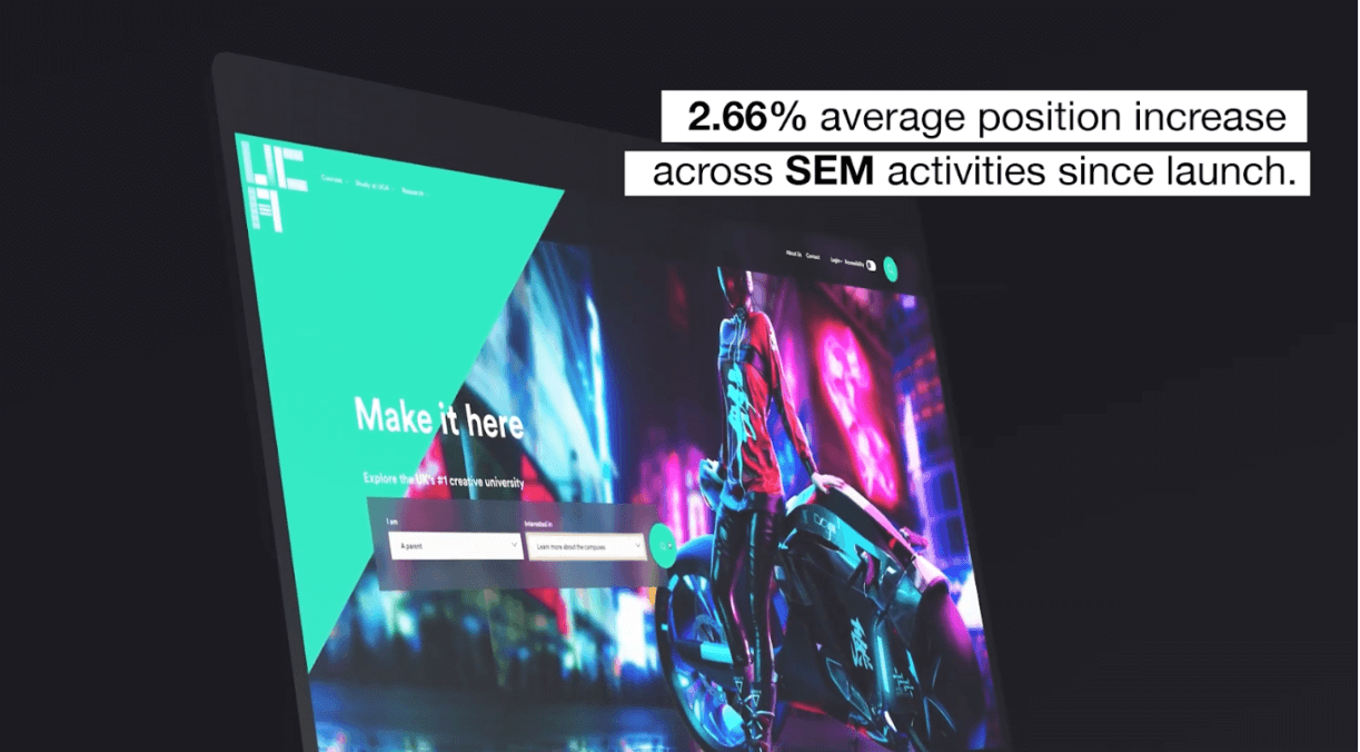
UCA’s website delivered strong business results.

“We have been working with Granite for over 2 years now and it has been brilliant! They are a fantastic supplier to work with and we see them as an extended partner of our Digital Team. They are extremely thorough in their market knowledge and produce incredible designs. From our work with Granite we were nominated for a UX Design Award in 2021 and are extremely proud of that. We look forward to continuing our relationship”.
Rob Harling Web and Digital Manager - UCA
©GRANITE